Recognition
A fixed title treatment and recurring zones make each poster part of the same family.
Campaign & poster system
A fictional culture series with room for different voices.
Fictional concept study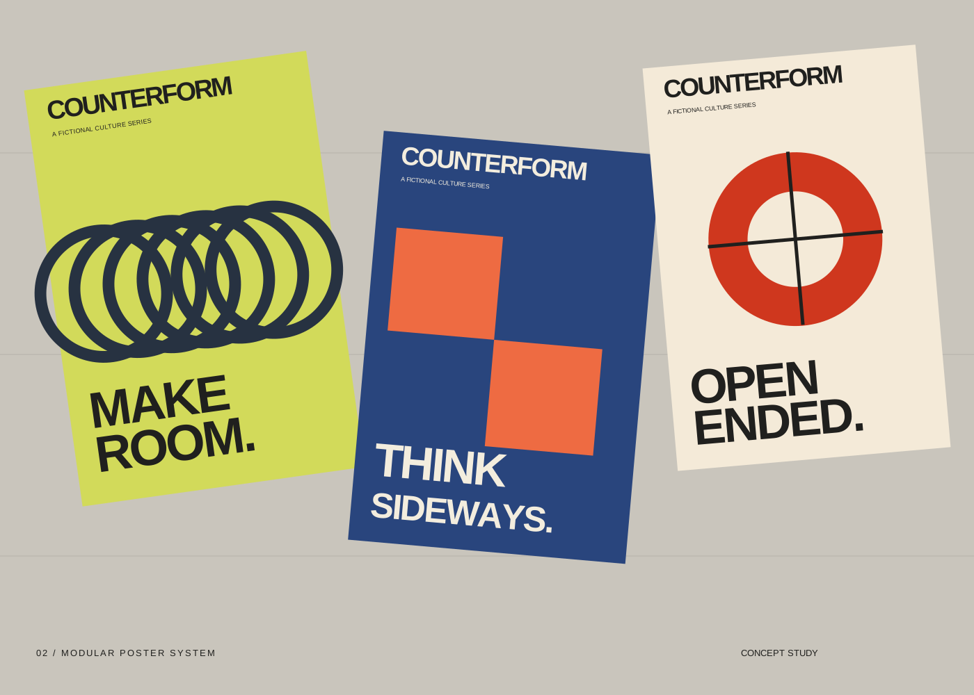
Counterform — original design exploration for a fictional brief.
The design question
Counterform explores how a poster series can feel related without repeating the same composition. The fictional brief calls for a culture program with a bold public presence. Each poster uses the same name, information zones and typographic weight, while the central form changes from a loop to a stepped shape to a divided circle.
The headlines describe ways of thinking rather than announce an actual event. A lime, blue and cream palette gives each piece its own atmosphere, while the repeated hierarchy keeps the series legible as one set.
The series keeps the top label and lower headline in stable positions. The middle area is a place to play: repeat, offset or cut one geometric form. This is the central system decision — hold the information still and let the image move.
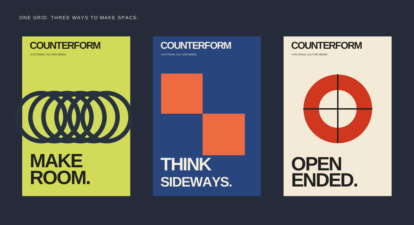
A fixed title treatment and recurring zones make each poster part of the same family.
Changing the geometric module creates movement without adding decorative clutter.
A clear separation between title, image and headline offers a useful starting point for other formats.