Hierarchy
The name and category retain their positions across the range, making the system easy to scan.
Packaging identity
Everyday pantry goods, brought together by simple shapes.
Fictional concept study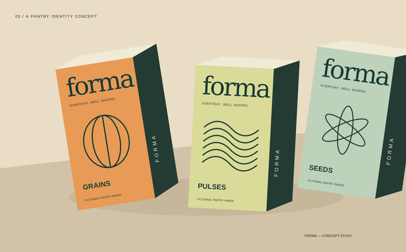
Forma — original design exploration for a fictional brief.
The design question
Forma is a fictional pantry identity that studies how a package can be both recognizable and differentiated. The illustrated range groups grains, pulses and seeds under one soft wordmark and a shared front-panel structure. Color and line work separate the categories while the name stays in the same place.
The warm palette and restrained botanical geometry suggest everyday utility rather than luxury. The mockups are original vector illustrations, used to explore the visual system; they are not photographs of a manufactured range.
The package puts the wordmark first, the category next and a distinct geometric pattern between them. Repeating that hierarchy creates a family without making every carton identical. Production specifications, ingredients and mandatory product information would need a real brief and specialist review before any physical use.
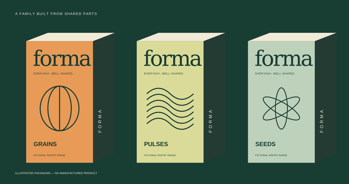
The name and category retain their positions across the range, making the system easy to scan.
Three related colors and line motifs distinguish the categories without fragmenting the identity.
The concept is kept separate from manufacturing. Dimensions, substrate and proofing belong in a production brief.