Hierarchy
One large masthead anchors the cover. Small utility type supports it instead of becoming a second headline.
Editorial identity
A journal for small observations and wider perspectives.
Fictional concept study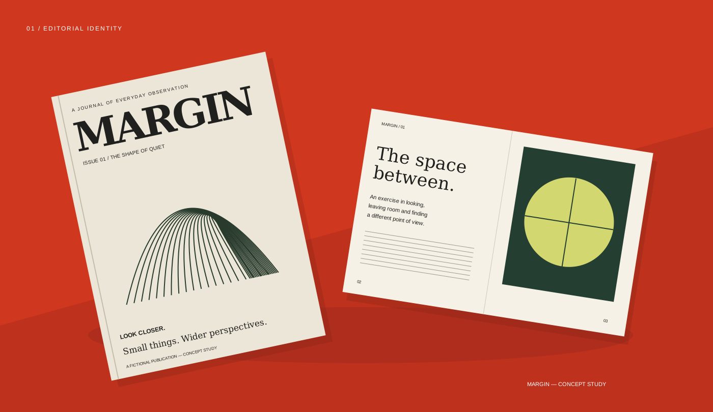
Margin — original design exploration for a fictional brief.
The design question
The fictional brief is an independent journal about noticing ordinary things. The challenge is to make a restrained editorial voice feel recognizable without crowding out the content. Margin pairs a generous title with a fine, repeating line motif: the cover can be identified from a distance, while the detail rewards a closer look.
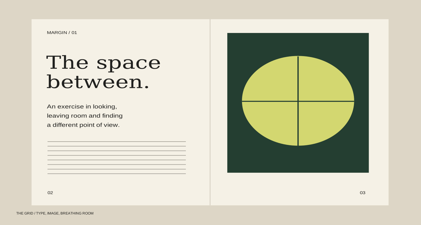
The spread uses a simple two-column structure, a strong opening phrase and a deliberate block of image. A cream ground connects the cover and interior. Forest green introduces depth without turning every page into another cover.
The cover asks for attention; the inside gives it back to the reader. Type size establishes the opening, body copy follows a stable measure and the circular image carries the strongest color. Repeated folios and small labels create orientation without competing with the story.
One large masthead anchors the cover. Small utility type supports it instead of becoming a second headline.
Wide margins and a consistent text measure make room for a slower reading pace.
The same cream, green and fine-line language connects the cover to the opening spread.